Sunday 26 July 2020

American Dream's Costumes

Now, this probably should have come out much earlier but for various reasons no one cares about, it didn’t. So for this next entry in my new favourite research-heavy series of posts about the MC2, we’ll be looking at the statuesque blonde champion of truth and justice herself, the MC2’s Avengers own Shannon Carter aka American Dream. Specifically, we’ll be taking a deep dive through her various appearances to showcase any and all of American Dream’s Costumes.


Obviously, the star-spangled Avenger’s most iconic costume is her most used design which first appeared fully in A-Next #4, alongside the rest of Shannon’s Dream Team members. Artist and co-creator Ron Frenz had this to say about designing the look on Adam Chapman’s Comic Shenanigans podcast:


‘I was working too hard to avoid the obvious. When I first conceived of the idea of doing a female Captain America, I playing with a bunch of different ideas. One of them was a black girl with no hair sticking out the back. What I didn’t like at the time - which I look back at it now it’s probably something I shouldn’t have worried about - I didn’t like the way the brown skin looked against the medium blue of the suit. So, I kept playing with different ideas, we had a lot of different ideas; a lot of different ideas for names, a lot of different ideas for approach. At one point what occurred to me - and which I thought was something Tom responding to well- was we weren’t going to make her related to Steve Rogers. We didn’t know enough about Steve Rogers to have her be a cousin or something like that. But Sharon Carter was right there and I said ‘well, wait a minute! She’s related to Sharon Carter!’ And right there, I said ‘screw it, I’m going to make her a statuesque blonde!’ We just kind of went with it from there.’


Here are some of the initial designs that Ron has shared online in the past, presented in no particular order. These really demonstrate the process and give a nice taste of what could have been:


As usual, we’ll be doing things from an in-universe chronological order. With that said here’s the earliest ‘costume’ for Shannon Carter as seen during a flashback in American Dream #3. It’s really just Shannon’s gymnastics attire, but I like that she’s almost always colour coded in red, white and blue. It’s a nice touch.


Here’s more gym attire from Shannon’s high school years, specifically from her first meeting with Brandon Cross (later known as Freebooter) as seen in the next flashback in American Dream #3.


It’s not clear exactly when, but Shannon got a job as an Avengers Compound tour guide, so I figured I’d include it here rather than ignore it or place it later. First appearing in Shannon’s first appearance in A-Next #1, this uniform returns in the American Dream mini-series.


Just as we did with Freebooter, I’m going to also include Shannon’s martial arts training uniform or ‘gi’ (American Dream #3). It’s worth noting that neither Aerika nor Blue wear these uniforms here, suggesting only Brandon and Shannon had martial arts focused training. This would make sense given the two young women have superhuman abilities while Shannon and Brandon have only their skills to rely upon.


Up next, we have Shannon’s first superhero identity: Nomad. Presented to her by her mentor Clint Barton aka Hawkeye as a graduation gift, Shannon expressed her desire to evoke the image of Captain America and carry on his legacy (American Dream #3). I’ve done some colour changes to give you an idea of what it would have looked like without the flashback colour filter.


American Dream #4 finally depicts our earliest instance on-panel of Shannon wearing her iconic American Dream costume, just in time to see the newly formed Avengers team gain headlines.


In the pages of A-Next #3 we get a white and red variant of Shannon’s tour guide uniform. It’s this same issue that we’d see the Dream Team for the first time, hidden in shadow prior to their debut next issue.


In the real world we’d get our first glimpse of the American Dream costume in full in A-Next #4. Nuff Said!


Two issues later, we get a new American Dream costume and tour guide uniform all rolled into one, with A-Next #6 giving us this design which resembles one of Ron’s design sketches above. I kind of like it, though it makes me wonder whether Shannon’s secret identity is public knowledge and it’s just Hope Pym that is oblivious to it in the American Dream mini-series?


While not an actual alternate costume, we see Shannon in her American Dream suit without her mask on in A-Next #8 so here it is, for my completeness sake.


American Dream has a slight change of look while on the parallel world ruled by Doom in A-Next #11, when her long golden locks are cut off to allow her to gain the upper hand in a battle. This look remains consistent for a while after the A-Next series concluded with Shannon’s guest appearances retaining the short hair until Spider-Girl #30. From then on, Shannon presumably used a wig to cover her shorter hair while it regrew. It goes without saying, from A-Next #11 onwards Shannon wields the iconic shield of the alternate world’s Captain America.


Backtracking slightly, I wanted to mention the occasions where Shannon has run out of her wrist and calve-mounted projectile disks, or when her disk launchers have been removed by an opponent (A-Next #12, American Dream #4).


This next one is a bit of an oddity. Presented as a bonus pin-up image in the Spider-Girl Annual ’99 we also see new costume design by Ron Frenz once more. I’m also guessing there may be a colouring error on the boots and gloves, but who knows?! This scene might be canon, but I’m not sure where you’d place it if it is. I’m probably just overthinking it!


 Here’s what Ron Frenz said about it in the aforementioned podcast interview:


‘I had also come up with a different design that only showed up once in a pin-up in a Spider-Girl Annual. There was a pin-up of Spider-Girl fighting the Avengers and the team involved Coal Tiger and a different design of American Dream where her costume was a darker blue and she had no hair sticking out. That was a thought I had, because she promises herself in issue eleven ‘if being a soldier is the only way I can rid the universe of scum like you then a soldier is what I’ll be’ or something like that. So I kind of saw Shannon as possibly going through a darker time, a more serious approach to everything. Which ended up not being the way the character went because the book got cancelled and she ended up in the hands of Defalco and Todd Nauck and Pat Olliffe and a bunch of other people. C’est la vie!’


Back in Spider-Girl #31, there seems to be either another disk on her wrist area or else some kind of never before seen gadget which doesn’t return the following issue or ever again.


Skipping forward to Spider-Girl #81 which is both a great story and great source of colouring errors, we see a few different colour mistakes, with the white areas of Shannon’s costume appearing flesh-toned and a bluer colouring on her entire suit on another page. The bare arms look returns in Spider-Girl #83 with Dream also having blue coloured disks (this will happen on and off, just go with it!) and carrying a silver shield which sometimes appears to have a ring of colour. The blue disks with the addition of blue gloves also cameo. Moving on!


In her own American Dream mini-series we get a good look at Shannon’s motorcycle and because she’s a paragon, her costume includes a themed helmet. We’ll be seeing a lot of this helmet in later stories.


Also in this mini-series, for the first time (outside of a cover image for Last Hero Standing) we see the classic Captain America-style wings atop American Dream’s mask, courtesy of artist Todd Nauck,


Appearing in the Spectacular Spider-Girl mini-series, we get a new variation on Shannon’s classic American Dream costume by Ron Frenz. Here, the red and blue stripes do not extend to the back. This look appears with and without the helmet, but notably doesn’t include the little wings on the mask.


American Dream next appeared in the Captain America Corps mini-series, with wings on her head again and stripes all the way around her abdomen. But this time, the stripes form a slightly different cut which doesn’t point upward toward the star on her chest.


Another variation which seems to only appear mid-way through a battle seen in Captain America Corps #4 and #5 is the addition of a belt with pouches. Presumably Shannon picked this up during the conflict because it’s not seen beforehand and is absent upon her return to her home reality. Dream also uses a firearm in this battle.


Finally, for the MC2 story during Secret Wars: Spider-Island, American Dream returns to the variant of her costume seen in the Spectacular Spider-Girl mini-series.


I think that’s it. If you think I’ve missed out on a costume, please let me know. I can take it! I think American Dream has the perfect blend of classic and new in her costume design which makes her stand out as a unique and iconic character in her own right.


Until I throw together my own red, white and blue star and striped costume, I remain


frogoat

Tuesday 30 June 2020

Mainframe's Robotic Shells

Usually I title this series ‘(Character)’s Costumes’ but given the subject of this latest entry, it didn’t seem to apply, nor did I think ‘Mainframe’s Body’ sounded appropriate, especially given what we worked out last time for A-Next Ages. So, this upload we’ll look at all of the program’s appearances in an effort to cover all variants of Mainframe’s Robot Shells.


Mainframe’s iconic and rarely changed armoured exterior first debuted in A-Next #1, where the character notably proposed the founding of the new Avengers team alongside Thunderstrike, J2 and Stinger after Jubilee, Jolt and Speedball bowed out of full-time membership. Here’s what co-creator and artist extraordinaire Ron Frenz had to say about the design of Mainframe on episode 744 of Adam Chapman’s Comic Shenanigan’s podcast:


 ‘Design wise- I mentioned this in one of our last letter columns in A-Next- when I was originally designing A-Next, there’s a guy I went to art school with, he’s one of my oldest, dearest friends who is terrific at design. He actually did a few jobs for Marvel in the late 80’s or early 90’s. His name is Rich Yanizeski and I think he has a terrific outside-the-box design sense where he’ll try a little bit of everything. He of course, being a separate entity has a separate pool to draw from of inspiration and designs he’s seen and things like that. So usually when I’m called upon to design new characters, I will actually ask Yan if he’d be willing and able to step in and pitch some stuff to me. Quite often the final design ends up being some amalgamation of what Rich pitched to me and my own ideas and tailoring them to the specifics of what we know about the story or the character at that point.
Mainframe was one of those characters. We went through a couple of different designs, the early designs still had red and yellow in them and everything. I’ll be perfectly honest with you, what occurred to me about what I like about black and gold is that I’m from Pittsburgh and that’s the colour of all of our sports teams. When I put it on paper it looked really good so we were fine with that. I do remember being at a convention one time when Jim Shooter was doing a slide presentation about Iron Man’s new armour and everybody in the crowd was just crazy about the idea of Iron Man’s armour being black and silver. I never understood it. That’s basically what they ended up using for War Machine. But I never understood it because it’s a four-colour medium at the time, it’s a full colour medium now. Why would you do that?
 But, like I said, with my own affinity for black and gold I went ahead and gave it a shot and I liked what it looked like. I probably wouldn’t have liked it as much if not for the red eyes because I think the red eyes kind of pop and hold everything together. It always frustrated me when the eyes didn’t get colour red because I always considered that a part of the design. He was very much a cross between what was going on in the Iron Man book at the time, meaning he was a cross between Iron Man and War Machine because I liked the bulk of War Machine. I had gotten the chance to draw War Machine in an issue of Thunderstrike and I liked the weightier feel of War Machine. That’s what I was kind of trying to do more with the forearms and through the shoulders and everything of Mainframe.’

The earliest chronological appearance of Mainframe is a flashback in Spider-Girl #95, which seems to depicts Tony Stark building the first of Mainframe’s robot shells. Unless I’m mistaken this first model doesn’t appear to deviate from the standard Mainframe armoured shell.

I’m not really sure if this one counts but here is what I believe is the computer Mainframe’s consciousness dwelt in before being activated, as depicted in A-Next #1.


While I won’t note every time Mainframe loses a robotic shell in battle, I would like to point out the first time this occurs from A-Next #3, where Sub-Mariner and the Hulk tear it in two. It would appear this is traumatic event is the first ever occasion in which Mainframe’s physical body had been compromised beyond repair. Mainframe seems pretty nonchalant about the event, or at least is playing it down by referring to it as only a ‘lifeless shell’.


This ‘lifeless shell’ is also seen in J2 #3 in a story depicting these same events. However, here Mainframe seems to have red-coloured ‘ear’ interiors. Yeah, I’m not sure what you’d call those things. 


Speaking of those robotic bodies, after expending all available manufactured shells we get a glimpse of Mainframe’s true self beneath both the exterior and core module. Better still, we get to witness the construction of a brand-new Mainframe robot shell (A-Next #8).


At the conclusion of the A-Next series, we see a slightly different design for Mainframe with A-Next #12 which carries over into other MC2 titles beginning within the pages of Spider-Girl #13. Artist Ron Frenz gives us a slightly different robotic shell design for Mainframe.  *Thanks to Ron Frenz for the correction*


Notably, the wrist areas are slimmer and have a visibly segmented design to them. In addition to this we get what I believe is the first of many, many future colouring mistakes on the lower leg or ‘greaves’ of Mainframe’s armoured exterior with Spider-Girl #13. Areas of the 'phase 2' gauntlets also alternate in colour between yellow and black on different pages


This black miscolouring on the lower legs of Mainframe’s various shells is seen in several future comics including Spider-Girl #31, 38, 46, 59, 71 and 81. The miscolouring occurs so frequently, I’m tempted to say it’s more than the correct colouring of Mainframe’s robot shell! Maybe it really is a different design?


Another apparent colouring error that is seen in both Spider-Girl #25 and Spider-Girl #31: Mainframe’s centre chest piece appears to be black and in the latter example, so are the raised shoulder pieces or ‘pauldrons.’


For what I believe is the first time, Mainframe’s wrist devices are shown to hold weaponry in Last Hero Standing #1. In the past, we’d seen other uses for these including interfacing with high tech equipment and plugging directly into the internet, but I don’t think he’d seen this particular function before. As the Last Hero Standing mini-series is pencilled by Pat Olliffe, the wrist devices are again of a slimmer design. Combining this slimmer design with the correct colouring on the lower legs, we actually get a unique look again, all be it one that was probably intended to be seen since Spider-Girl #13! This design returns under Mainframe co-creator Ron Frenz in later issues of Spider-Girl.

The Last Planet Standing mini-series again gives us more examples of the miscoloured black booted lower legs on Mainframe’s shell. But the cover to Last Hero Standing #1 seems to offer a different boot design entirely, inked darker and without the segmented sections we’ve always seen, miscoloured or otherwise, up to this point.

We actually get a few alternate designs for Mainframe in the Last Planet Standing mini-series. Here’s Mainframe soaking up extra electricity from the power grid from Last Planet Standing # 3.
This isn’t technically a new look so much as a sort of power up, but in the very next issue we get this upgrade which absolutely is a brand-new design (Last Planet Standing #4).


This is device that we see Mainframe piloting was designed by Reed Richards and modified on the fly with input from Tony Stark in an attempt to help defeat Galactus by multiplying Mainframe’s powers by a ‘a few hundred thousand times.’ While the upgrade allows Mainframe to pierce Galactus’ barrier, the robot shell is soon destroyed (Last Planet Standing #4).
 
Awakening aboard the orbiting satellite that houses and manufactures all the robotic bodies, Mainframe activates all of the available backup bodies, piloting them all at once as an assault force to counter Galactus’ Punisher robots (Last Planet Standing #4).


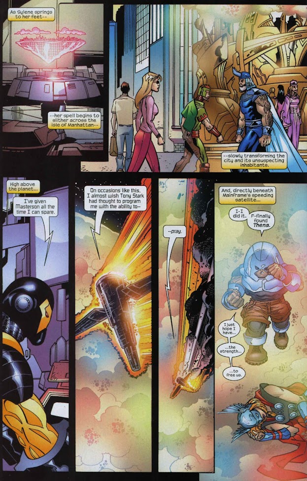
We get the natural extension and progression of this idea in Avengers Next #5 when Mainframe uses the orbiting satellite itself as a weapon against the Asgardian sorceress Sylene, piloting it on a collision course with her volcanic island base. This naturally eliminated Mainframe’s ability to replicate, at least for the time being.


Another notable design change appears only in Spider-Girl: The End where we see that Mainframe exists again as a computer program of some kind aiding an aged Stinger to develop humanity’s last hope, The Mulligan, a time travel platform. Perhaps in this possible timeline, Mainframe’s satellite was never rebuilt? It's a nice nod back to Mainframe's first appearance.


Finally, from the MC2 story in the Secret Wars Spider-Island mini-series, we get a cameo appearance by Mainframe, this time as only a hologram. For whatever reason, Mainframe is not a member of the Avengers team at this point (Spider-Island #1).

Due to Mainframe’s unique nature, I had to stretch the definition and parameters for this one! I hope it was comprehensive, but if you think I’ve missed anything let me know. I would love to see Mainframe begin to develop new body designs in the future. The use of all the robot backups at once has to be a highlight for the character, and certainly a personal favourite moment of awesome.

Until I manage to rebuild an entire satellite with enough materials to produce hundreds of duplicate robotic bodies, I remain

frogoat